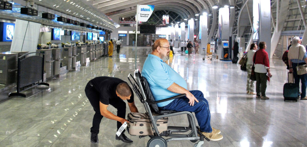
No longer just a place to grab a burger while waiting to board a flight, modern airports are packed with opportunities for passengers to enjoy the visit. But changes need to be made if all passengers are to benefit equally from the amenities on offer, explains disability advocate David Martin.
Today’s travelers have come to expect fashionable restaurants, upscale shopping, museum-quality art and concierge services. Providing the atmosphere and choices that entice passengers to explore – and spend – while they wait requires investment in architecture and interior design. Billions of dollars are flowing into terminals to make them feel less like a necessity and more like an experience. This spending on infrastructure is a prime opportunity to eliminate barriers that prevent or hamper people with disabilities from fully participating in the new airport experience. Building-in accessibility costs a fraction of adding it after the fact. It is the right thing to do both economically and socially.
Here are seven practical ways to incorporate Universal Design to build an appealing and inclusive airport terminal.
Equitable use: the design is useful and marketable to people with diverse abilities
Access begins with being able to move freely and independently from one location to another. In airport terminals, consider replacing interior and exterior doors that must be pulled open or operated by push button assist with automatic sliding glass doors. Engage individuals with disabilities throughout the process and invest in their ideas.
Flexibility in use: the design accommodates a wide range of individual preferences and abilities
One example of this is the placement of amply sized elevators at strategic points throughout the interior, with primary consideration to where wheelchair users might be arriving or accessing services. This is also essential so that ground personnel can transport a power wheelchair from the boarding point to the aircraft.
Simple and intuitive use: where use of the design is easy to understand, regardless of the user’s experience, knowledge, language skills, or current concentration level.
Wayfinding signage is a prime example of this. Signage should answer a range of questions from people of varying travel experience, languages and cognitive abilities. It should have a simple, sleek design void of clutter or confusion. Ample font size, background contrast and use of universal symbols is important. Provision of audio guidance for those who may need it is essential. Place monitors in spaces where they are easy to read, not blocked by a glare of sunlight.
Perceptible information: where the design communicates necessary information effectively to the user, regardless of ambient conditions or the user’s sensory abilities.
In addition to easy-to-follow wayfinding signage, textured floor tiles near entrances or at ground transportation access points and proper lighting can communicate information to passengers with diverse abilities. Audio description is another excellent offering to consider for people with low vision. All of these elements are ways to incorporate inclusion without compromising design.
Tolerance for error: the design minimizes hazards and the adverse consequences of accidental or unintended actions
Airports should be looking for services, equipment and design that has failsafe options built in for the fixed environment. Staxi transportation chairs and aisle chairs are designed to meet this standard, having been engineered with a failsafe braking system that eliminates a frequent source of occupant injuries and enables attendants to focus on assisting the customer.
Low physical effort: the design can be used efficiently and comfortably and with a minimum of fatigue
Airports should use transportation systems like electric carts, people movers or power assisted equipment to move passengers with comfort and dignity, while limiting the physical effort needed to do so. Autonomous wheelchairs and power movers are important elements in meeting this standard. Movement and storage of these devices in the terminal is a design element that should not be overlooked.
Size and space for approach and use: appropriate size and space is provided for approach, reach, manipulation and use regardless of user’s body size, posture or mobility
When designing corridors, queueing areas and entries or exits, ensure spaces are wide enough for mobility equipment to move through without touching the sides. Also consider the placement of signs and counter heights to ensure they are accessible for all.
Eliminating barriers to people with disabilities goes beyond complying with legislation. It requires deliberate attention at each step of the facility design process and an ongoing review system. Accessibility enhances the experience for all visitors, regardless of ability.

