Russell Holmes, strategy director at ico Design, explores how creating the right brand can help airports to better meet the needs of their customers, passengers, stakeholders and the local community
“Why create a brand for an airport?” It’s a question we’ve been asked a number of times since we unveiled our rebrand for London Luton Airport (LLA). The answer is simple – to respond to passenger needs and expectations.
The traveling public has changed a lot in the past decade. They’ve been inspired and empowered by low-cost airlines, and technology is giving them increasing control. Experience points such as the check-in desk are rapidly becoming relics of a bygone age. It’s a shift that’s affected all aspects of transport. Fifteen years ago, London’s major rail stations were unwelcoming, functional spaces. Today, St Pancras International is a place to meet, drink and shop – even Fortnum & Mason have a store there.
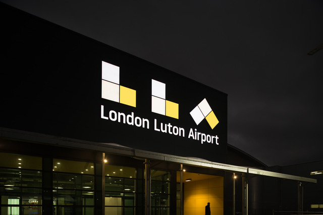
When viewed in this context, developing a brand that aligns an airport’s commercial future with passenger needs becomes far more important than simply designing a new logo for the terminal fascia. It becomes a strategic business decision, an opportunity to refocus the customer experience in light of commercial and cultural change.
At their heart, all successful brands have a clear vision that defines and differentiates them – one that can be easily articulated to staff, partners and customers. Arriving at this vision requires active participation from all the senior team in the organization, be it an airport, a tech company or a food retailer.
At the start of the process, a consultancy such as ico Design needs to ask the challenging and often uncomfortable questions that will lead to a vision that everyone agrees on, and, importantly isn’t just some meaningless words on a page.
With our work for LLA, this process involved all the airport’s senior management, the local council, key airline partners, retailers and staff, and took into consideration the passenger research the airport had undertaken.
Our role in this initial process was to make the senior team recognize the difference between the things that made LLA function as an airport (the baseline), and the aspects that made it unique.
The temptation, when attempting to do this exercise internally, is to fall into defining your organization pragmatically, without looking beyond the sector and considering all the outside factors such as competition, cultural change and customers’ perceptions.

We arrived at four brand values that defined the airport’s difference. These were encapsulated in a succinct brand essence: ‘Simplicity with a smile’, a determination to deliver easy and enjoyable travel for all passengers, with moments of delight along the way.
The importance of getting to this point and agreeing it can’t be underestimated. Think about ‘Just do it’ for Nike – only three everyday words, but they carry so much weight, communicating the attitude of the company, influencing its marketing, product, sponsorships, etc.
Once the strategic underpinning of the brand is agreed, then begins the creation of the visual identity. Without the rigour of this first strategic phase, the logo and visual identity would be designed without context.
There are no hard and fast rules for designing a logo or visual language, but a good benchmark is to look outside the sector for inspiration, not inside. When we set about creating the identity for London Luton Airport, we spent a lot of time researching other airport identities.
With only a few exceptions they include a swoosh, a plane, runway or some kind of arrow – all incredibly literal, outdated interpretations – revealing that when it came to visual expression, it’s a very insular industry. After all, supermarkets don’t feel the need to have logos which feature trolleys or shopping bags.
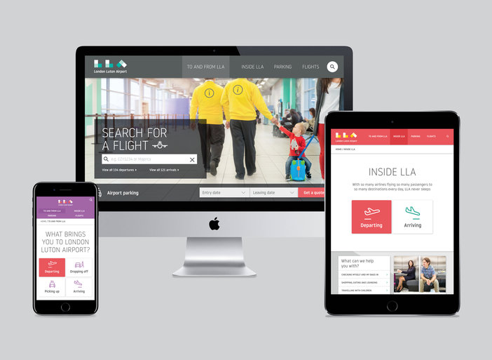
Our main insight when creating the identity system for LLA was to make it fit for purpose, give it longevity and the flexibility to work across any aspect of the physical infrastructure, but most importantly making it work on screen.
 The website is driven by ‘Simplicity with a Smile’, with a card-based system displaying only the information that passengers need at each specific part of their journey, acting as a friendly guide, rather than bombarding them with a lot of information that may not be relevant.
One of the primary reasons for developing a recognizable visual identity and tone of voice is that tomorrow’s brands are going to communicate in ways that we can’t yet imagine (Instagram, for example, is less than a decade old).
Organizations need to understand what they stand for, not only internally, but also in their customers’ eyes, and be able to communicate coherently and creatively using every appropriate medium.
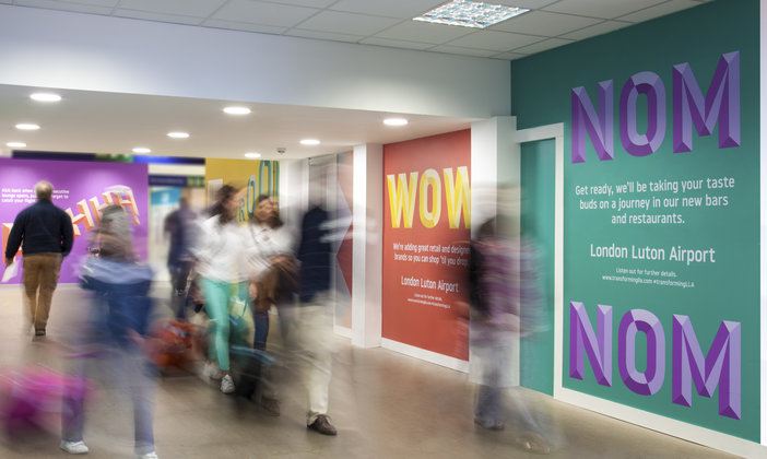
The flexibility of the LLA identity allows it to work differently on uniforms, buses, wayfinding, even informational films – without resorting to simply applying the logo everywhere. It’s a system of carefully defined elements that give designers, internal teams and external specialists, such as uniform designers, a great deal of creative scope.
Finally, it’s worth noting that the key success of a brand is belief. If it’s strategically grounded and based on truth and insight, it will have every chance of becoming an incredibly powerful asset.
A brand must be championed by the business leaders and its importance properly communicated internally so it is adopted by staff. If this process is well managed – as was the case for LLA – the new brand will be seen as a catalyst for change that can act to drive the entire business forward.
About the author
 Russell Holmes is strategy director and partner at ico Design, a London-based design studio that creates and builds memorable brands for businesses and organizations with ambition. Holmes has an MA in communication design and over 25 years’ experience in branding and design, working with many of the world’s leading brands. Holmes has been instrumental in developing the brand for London Luton Airport, working alongside the team at the airport for over five years. The new brand is part of the airport’s ambitious £160m (US$204m) redevelopment and is currently being rolled out across all points of customer and staff touchpoints and communications.


